We recently teamed up with the Community Foundation for Northeast Georgia to present our annual storytelling workshop for nonprofits. For this year’s topic, The Power of Visual Storytelling, RPS Creative Director and CEO Amanda Sutt gave a presentation on telling your story through infographics. While this presentation was for nonprofits, the truth is infographics are great visual tools that any organization or business can incorporate into their storytelling efforts. Read on to learn a little more about infographics and some tips for adding them to your strategy, or scroll down to watch a recap recording Amanda posted on YouTube.
What is an Infographic?
The short definition from Merriam-Webster is “a chart, diagram, or illustration (as in a book or magazine, or on a website) that uses graphic elements to present information in a visually striking way.” Digital marketer and bestselling author Jeff Bullas further describes infographics as a mixture of analysis, design, and writing that help present deep or complex data in “a visual shorthand.” He also says they are an efficient way to combine the best text and pictures with other design elements to tell a “story that begs to be shared.”
Why We Need Infographics
So why should you consider using infographics in your storytelling? Consider this quote from researchers Barbara M. Miller and Brooke Barnett:


 What Makes a Compelling Infographic
Now that you know why infographics are important and how effective they are, it’s time to take a look at what makes an infographic compelling. Here are a few pointers on what to include in order to convey your info in a way that will make it eye-catching.
What Makes a Compelling Infographic
Now that you know why infographics are important and how effective they are, it’s time to take a look at what makes an infographic compelling. Here are a few pointers on what to include in order to convey your info in a way that will make it eye-catching.


 When it comes to designing your infographic, we recommend content first, then the creating graphics. Create the outline of the story or information you want to share, sticking to a single focused topic if possible. Then, do your research for supporting information. Write your intro and any supporting headers or bullets you need, and make notes of what you want to convey with a visual. Remember that infographics should offer information as succinctly as possible. If you have too much copy and too many visuals, your infographic will look cluttered and readers will be more likely to pass over it. Think minimal text for maximum impact.
Consistent Branding: Why this is still important here?
We previously mentioned the importance of including your branding as a part of your infographics, and we can’t stress the importance of this enough. It’s not just so people can identify the infographic as your organization’s, but rather to ensure consistent branding with everything you create. That means that any copy on your infographic matches your brand voice and that the style of your infographic and the icons you use flow well from one infographic to the next. If the color palette of your infographic is different from your branding, use white or black to help set your brand information apart. In addition, including your branding will help ensure to readers that this content is coming from a reputable organization.
The bottom line: Infographics are a great tool to add to your mix of storytelling strategies. Give it a try and let us know how it goes! Feel free to download our infographic on the effectiveness of infographics to use as a reference point as you start creating your own infographics, and contact us if you have any questions.
When it comes to designing your infographic, we recommend content first, then the creating graphics. Create the outline of the story or information you want to share, sticking to a single focused topic if possible. Then, do your research for supporting information. Write your intro and any supporting headers or bullets you need, and make notes of what you want to convey with a visual. Remember that infographics should offer information as succinctly as possible. If you have too much copy and too many visuals, your infographic will look cluttered and readers will be more likely to pass over it. Think minimal text for maximum impact.
Consistent Branding: Why this is still important here?
We previously mentioned the importance of including your branding as a part of your infographics, and we can’t stress the importance of this enough. It’s not just so people can identify the infographic as your organization’s, but rather to ensure consistent branding with everything you create. That means that any copy on your infographic matches your brand voice and that the style of your infographic and the icons you use flow well from one infographic to the next. If the color palette of your infographic is different from your branding, use white or black to help set your brand information apart. In addition, including your branding will help ensure to readers that this content is coming from a reputable organization.
The bottom line: Infographics are a great tool to add to your mix of storytelling strategies. Give it a try and let us know how it goes! Feel free to download our infographic on the effectiveness of infographics to use as a reference point as you start creating your own infographics, and contact us if you have any questions.
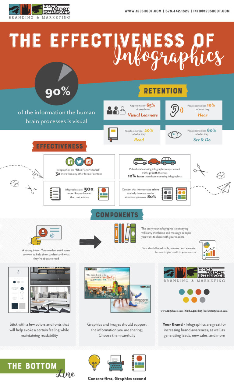
“On their own, text and graphics are both useful yet imperfect methods of communication. Written language allows an almost infinite number of word combinations that allow deep analysis of concepts but relies heavily on the reader’s ability to process that information. Graphics may be easier for the reader to understand but are less effective in the communication of abstract and complicated concepts…combining text and graphics allows communicators to take advantage of each medium’s strengths and diminish each medium’s weakness.”Still not completely convinced? Here are some additional reasons you need infographics.

- The more visually compelling you can make any facts, figures, or statistics, the better because it will be easier to read and process.
- Infographics help build brand awareness when your logo and brand elements are incorporated.
- You can use infographics anywhere. From printed pieces to social media platforms, newsletters, blogs, and even advertisements, infographics are great tools for giving your audience a quick snapshot of information that still makes an impact.
- They can help increase conversions, website traffic, and even your rank on Google if you optimize them for search engines.
- Infographics can help you showcase your knowledge and expertise on very specific topics.


 What Makes a Compelling Infographic
Now that you know why infographics are important and how effective they are, it’s time to take a look at what makes an infographic compelling. Here are a few pointers on what to include in order to convey your info in a way that will make it eye-catching.
What Makes a Compelling Infographic
Now that you know why infographics are important and how effective they are, it’s time to take a look at what makes an infographic compelling. Here are a few pointers on what to include in order to convey your info in a way that will make it eye-catching.

- Consider it the hook that will make people continue reading through the infographic. You only need a couple of sentences to make this first impression, so make it a good one.

- Remember that the story should be organized and in sequential order.

- Stats should be informative and from reputable resources.

- Keep your design clean and simple. Don’t go overboard with your font choices. Pick fonts that are easy to read and complement each other.

- Choose attention-grabbing graphics and images and avoid over-using them.

- Include your logo, social media profile names, and website URL so readers can find you later if they have questions or want to learn more about what you have to offer.
 When it comes to designing your infographic, we recommend content first, then the creating graphics. Create the outline of the story or information you want to share, sticking to a single focused topic if possible. Then, do your research for supporting information. Write your intro and any supporting headers or bullets you need, and make notes of what you want to convey with a visual. Remember that infographics should offer information as succinctly as possible. If you have too much copy and too many visuals, your infographic will look cluttered and readers will be more likely to pass over it. Think minimal text for maximum impact.
Consistent Branding: Why this is still important here?
We previously mentioned the importance of including your branding as a part of your infographics, and we can’t stress the importance of this enough. It’s not just so people can identify the infographic as your organization’s, but rather to ensure consistent branding with everything you create. That means that any copy on your infographic matches your brand voice and that the style of your infographic and the icons you use flow well from one infographic to the next. If the color palette of your infographic is different from your branding, use white or black to help set your brand information apart. In addition, including your branding will help ensure to readers that this content is coming from a reputable organization.
The bottom line: Infographics are a great tool to add to your mix of storytelling strategies. Give it a try and let us know how it goes! Feel free to download our infographic on the effectiveness of infographics to use as a reference point as you start creating your own infographics, and contact us if you have any questions.
When it comes to designing your infographic, we recommend content first, then the creating graphics. Create the outline of the story or information you want to share, sticking to a single focused topic if possible. Then, do your research for supporting information. Write your intro and any supporting headers or bullets you need, and make notes of what you want to convey with a visual. Remember that infographics should offer information as succinctly as possible. If you have too much copy and too many visuals, your infographic will look cluttered and readers will be more likely to pass over it. Think minimal text for maximum impact.
Consistent Branding: Why this is still important here?
We previously mentioned the importance of including your branding as a part of your infographics, and we can’t stress the importance of this enough. It’s not just so people can identify the infographic as your organization’s, but rather to ensure consistent branding with everything you create. That means that any copy on your infographic matches your brand voice and that the style of your infographic and the icons you use flow well from one infographic to the next. If the color palette of your infographic is different from your branding, use white or black to help set your brand information apart. In addition, including your branding will help ensure to readers that this content is coming from a reputable organization.
The bottom line: Infographics are a great tool to add to your mix of storytelling strategies. Give it a try and let us know how it goes! Feel free to download our infographic on the effectiveness of infographics to use as a reference point as you start creating your own infographics, and contact us if you have any questions.