Here’s the deal: There’s nothing like your boss calling you into the office and assigning you the tremendous task of creating the next segment of the video series for your website and social media marketing campaign, featuring your latest and greatest project. This is the big leagues and Coach is putting YOU in.
It’s easy to rush down the hall, grab the old banner stand from the closet, and throw on your fanciest pinstripe suit. But before you go to all that trouble, you need to think about how your video will look to your audience and how to best showcase what your business has to offer to make sure you’re shining the spotlight on it in the best way possible.
Certain textures, patterns, and colors can cause some serious camera backlash. Small patterns like pinstripes plaids are generally more difficult to see on video, and the last thing you, your company, or your product needs is to have vibrating patterns and or a blinding color to detract from a positive promotion moment. For that reason, we’ve created a list to help navigate through the good and the bad of TV camera effects.
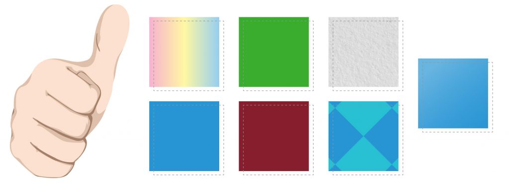 Good.
Good.
- Colors to Use:
- Medium/Pastel colors
- Blues
- Greens
- Maroons
- Textures and Patterns to Use:
- Solids
- Larger patterns
- Anything with a matte finish.
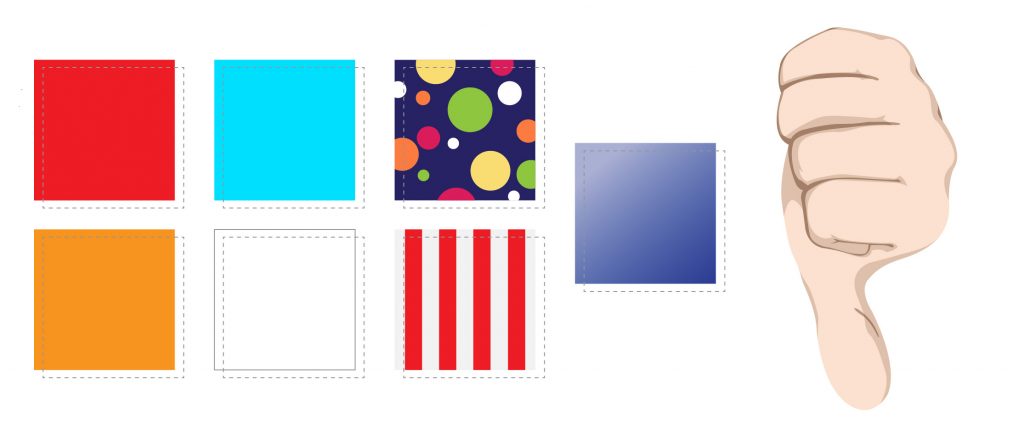
Bad.
- Colors to Avoid:
- Bright Reds
- Oranges
- Light Blues
- White
- Textures and Patterns to Avoid:
- Parallel lines
- Stripes
- Dots
- Reflective/shiny materials
The last thing you want to worry about when your name is in lights and the countdown to your 15-minutes of fame has started is whether or not people will be able to see you and your product. By avoiding these specific textures, colors, and patterns your product will be in the spotlight and your services will be well communicated as well.
See you on the big screen!


