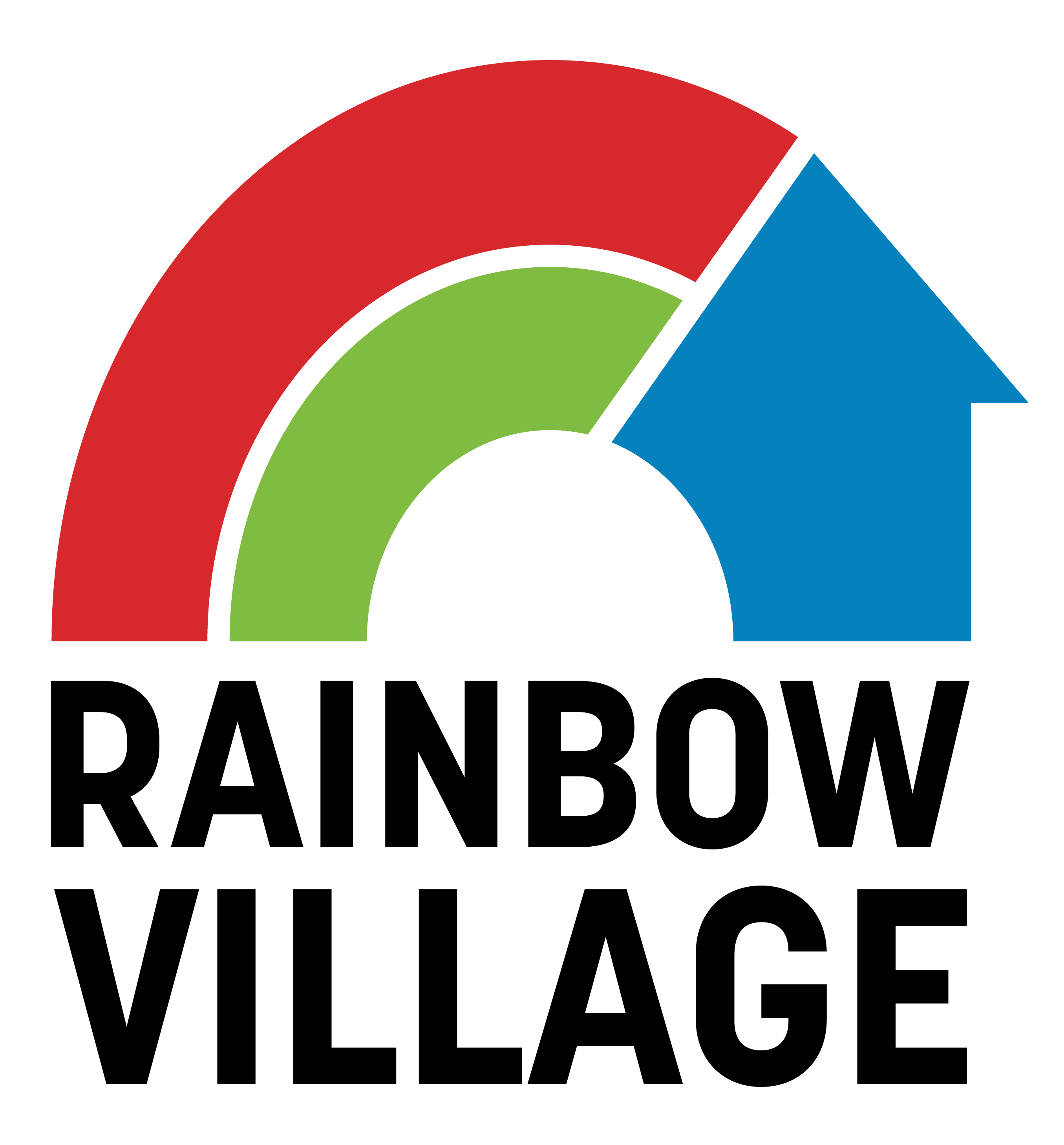
Rainbow Village Logo Design
The Challenge
Over the years, Rainbow Village realized that some members of the community didn’t know the full breadth of services Rainbow Village offered, with some thinking it was just a daycare or after school program and not realizing the many other programs offered to help families step out of homelessness. As Rainbow Village approached its 30th year, the organization knew it needed a clearer message to help the public understand who they are, understand the full scope of services offered, and how they help. The physical campus had undergone lots of physical growth and expansion to better meet the needs of those Rainbow Village serves, and leaders knew it was time to find a way to unify the brand and create a visual side that matched what the organization was and build out a message to communicate that.
The Solution
The first step we took was to update the visual brand by developing a more refined logo. Because some members of the community didn’t realize Rainbow Village offered more than a daycare center and an after school program in the past, we took the time to evaluate the existing color palette, which included bright primary colors one would often find in children’s programming. Ultimately, we determined to keep it and work on incorporating other visual elements to help communicate how Rainbow Village serves the entire family.
The refinement of the logo was thoughtfully considered to reflect the enduring work Rainbow Village is completing, with each piece representing a piece of the organization’s mission. Learn more about how we’ve woven Rainbow Village’s mission into each element of their logo in the video below.
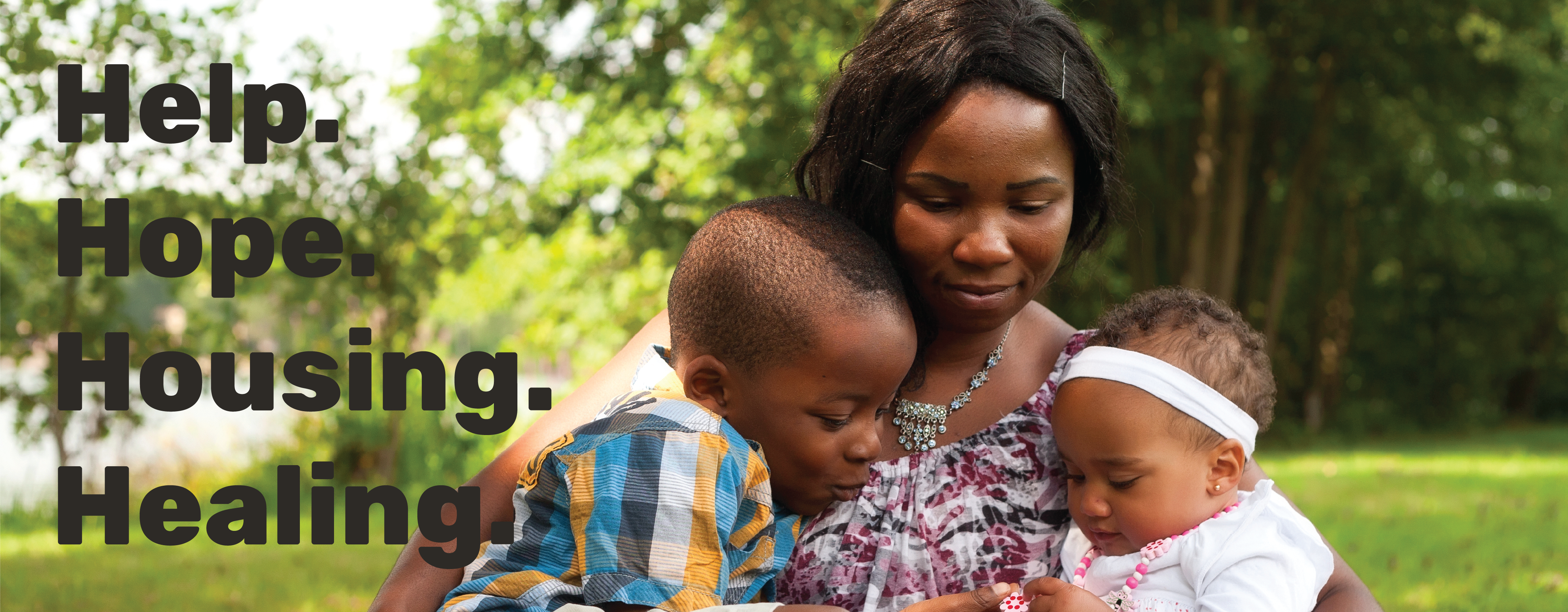
While working on the logo, we also began looking at the existing website in tandem with the previous messaging pieces to refine the tone and language used to communicate what Rainbow Village does to help families in need. We worked toward creating consistency across the board with the organization’s messaging, which will feed into the website. The website will serve as the messaging foundation that all future materials and messages will build off of to clearly explain how Rainbow Village serves as a place where families experiencing homelessness can find a foundation of help, hope, housing, and healing.
The Results
The new logo, paired with imagery that helps showcase how Rainbow Village serves families facing homelessness, provides a much more cohesive visual brand. The simplicity lends itself to the maturity the organization needed to convey. The new logo has been received with lots of positive feedback. The refined messaging has created a clearer picture of what Rainbow Village does. Together, the new logo and refined message showcase how Rainbow Village is a place providing temporary housing while giving residents the tools they need to learn new things and apply them after they leave the program to set them up for success. These elements will be eventually brought together in a new website that will show how Rainbow Village has and will continue to evolve in the years to come to continue serving families and helping them get back on their feet so the entire family can thrive.
''
To me, this bold new logo and the development of our new website are also symbolic of the fact that Rainbow Village is on a continuous journey of its own to seek out the most effective ways to help families in need. The growth of this nonprofit over the last three decades has been nothing shy of miraculous, but we want to continue to stretch and grow in new directions to help as many families as we possibly can.”
- REV. Melanie Conner
chief Executive officer, Rainbow Village
About Rainbow Village
Rainbow Village, a nonprofit agency in Duluth, Georgia, has helped families break the cycle of homelessness, poverty, and domestic violence since 1991 through a learning culture designed to equip residents and alumni to achieve success in the five key areas of Family Stability, Well-Being, Financial Management, Education & Training, and Employment & Career Management.

