Did you miss our recent webinar on The Power of Color? Read on for the full recap, or check out the video at the bottom of this post!
Fall is one of our favorite times of year because it’s such a colorful season here in North Georgia. The leaves are turning to brilliant shades of red, orange, and yellow and you can’t miss the colorful pumpkin patches that seem to be on every street. Drawing from the seasonal color inspiration, we want to encourage you to take a closer look at the importance of color and how it applies to your business’ branding and marketing efforts.
Now some of you may be wondering why focusing on color is such a big deal. Color is a reflection of your brand, and each color tends to be associated with certain characteristics or emotions that can trigger either positive or negative associations with your audience. With that in mind, you want to make sure you’re choosing colors that paint an accurate picture of your brand in your audience’s mind. Consider the following:
- Blue tends to be associated with feelings of trustworthiness, dependability, and commitment.
- Orange is energetic and warm, but as Sensational Color shares, it is known for stirring up stronger “love it” or “hate it” responses than other colors do.

- Red is naturally exciting and attention grabbing, but can occasionally conjure up negative feelings, especially when related to finances (“in the red”).

- Green is most common color appearing in the natural world and as such is typically associated with the environment and represents freshness and growth, but is also associated with money.

- Yellow tends to be related to happiness and optimism.

- Black is often representative of authority and power, but can quickly become too overwhelming.

Beyond the different associations one can have with a particular color, it’s important to think about the challenges certain colors may present. For example, sometimes red can either be too aggressive or appear more pink than you want it to. Yellow can be a particularly challenging color to work with because there are different versions and because of the way the human eye perceives the color. To add to the challenge, you may see one shade of yellow on one computer screen and it will look very different on another.
Many times, the challenges often come down to individual perception. For instance, men see a lesser range of colors than women do, which is due to evolution and genetics. Women have more alleles that allow them to see different wavelengths of color, thus seeing more colors.
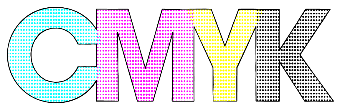
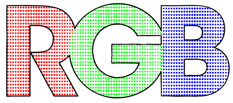
So how do you ensure the particular sea foam green that’s the main color in your branding looks the same from your printed materials to your website and everything in between? That’s where color systems come into play. Following are three of the more common color systems.
- CMYK, or Cyan – Magenta – Yellow – Black, is a print industry color model that uses these four colors as primary colors.
- RGB, or Red – Green – Blue, is an additive color system that is used in computer monitors, TVs, and in theater. This system only works in devices that employ light.
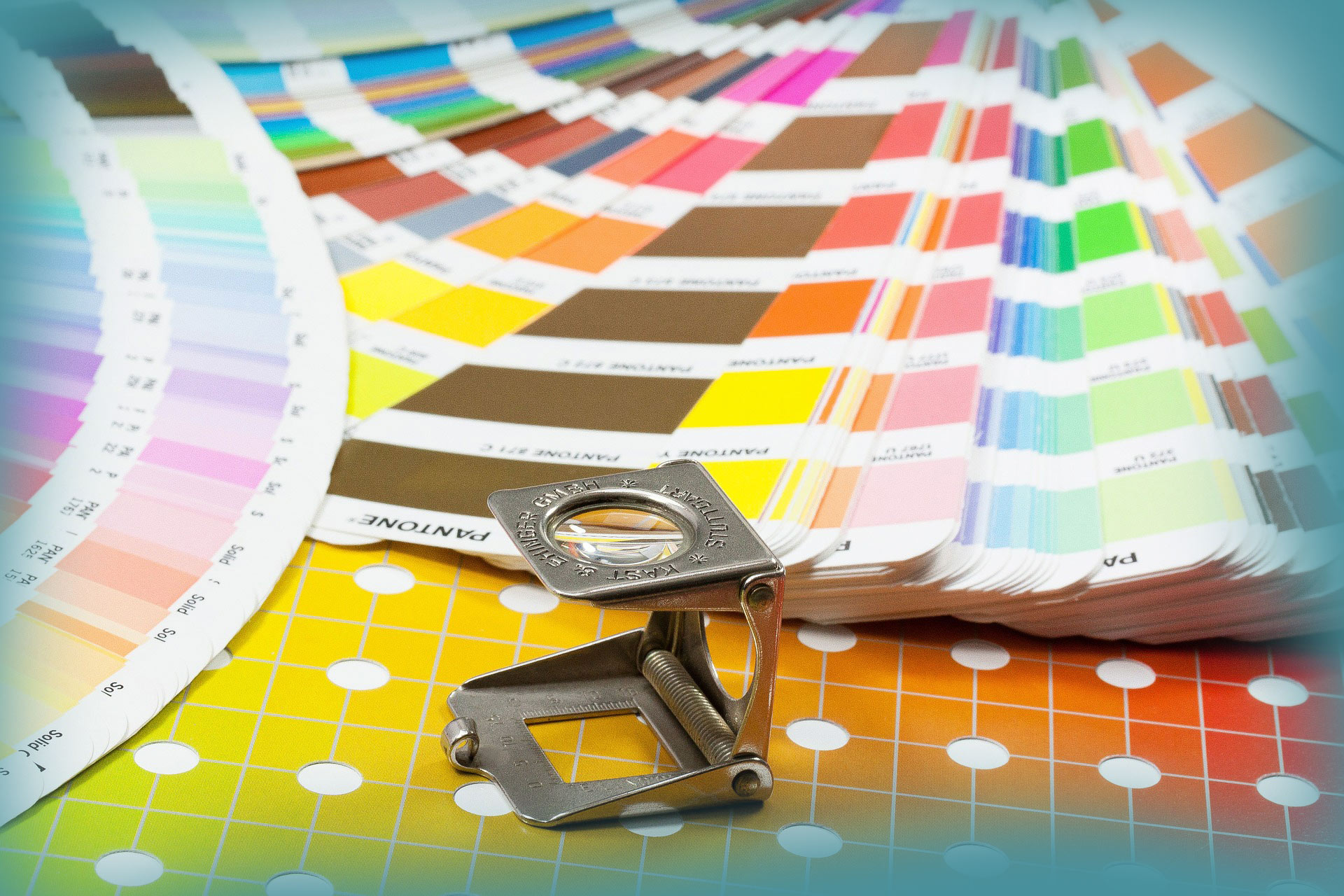
- Pantone Matching System, or PMS, is a commonly used color standardization system that most printers understand. This system not only offers consistency, but also allows you to use colors that can’t be mixed using CMYK.
Now that you know a bit about each color system, you may be wondering when to choose one over the other. As a general rule of thumb, CMYK is best for full color printing and full color photography; RGB is best for web use; and PMS is best to ensure that branding colors are consistent among printed marketing collateral and other items.
We know we’ve given you a lot of information to think about, so feel free to send us any questions you have about the power of color and how it relates to your business’ branding and marketing efforts.


