Renee Byrd-Lewis took the helm as the President and CEO of the Gwinnett Coalition for Health and Human Services (the “Coalition”) in October 2020 when founding Executive Director Ellen Gerstein retired after nearly 30 years of service. While there was strong brand equity and relationships within the community, the organization’s mission was not fully understood and it was perceived to be a government entity. With the support of the Coalition’s Board of Directors, Byrd-Lewis sought to create greater clarity for the organization’s role and its vision that all residents have the opportunity to thrive.
The Solution
We began by revisiting the organization’s branding and soliciting feedback from the Board of Directors, staff, and community leaders. We conducted a brand personality workshop, a key element of the rebranding process. The brand personality workshop focused on what we wanted others to feel or experience when interacting with the organization and how we wished others to describe the brand. This led to the development of the organization’s brand personality descriptors which became the core of our branding process. We also worked through our exclusive positioning exercise, which helped define what makes the Coalition uniquely different from other organizations in the county.
After the brand personality workshop, we led the team through a naming workshop. This co-creative process included brainstorming sessions where we expanded upon the work of our brand personality workshop, creating lists of keywords and phrases to drive the naming process. Specific words were selected to align with the newly created positioning statement and brand personality descriptors, as well as tagline options to spotlight the organization’s goals moving forward.
With the brand personality in place and new name finalized, we started working on rebranding. The process began with a homework assignment where key decision makers provided our team with examples of brands and logo elements they favored and disliked. We used this research and results from other workshops to create inspirational mood boards that incorporated fonts, color palettes, textures, and logos based on stakeholder preferences. We also dove into a bit of color psychology to make sure that the colors recommended for the new logo would accurately reflect the newly developed brand personality.
Once a design direction was selected, we designed logo options in black and white. Our process intentionally begins with black and white and then color is incorporated. Although color can be an important part of a logo, it can be distracting when trying to come up with a well-balanced design and should not be essential to make the design effective. Utilizing this strategy results in a very strong design that doesn’t rely on color alone.
The Results
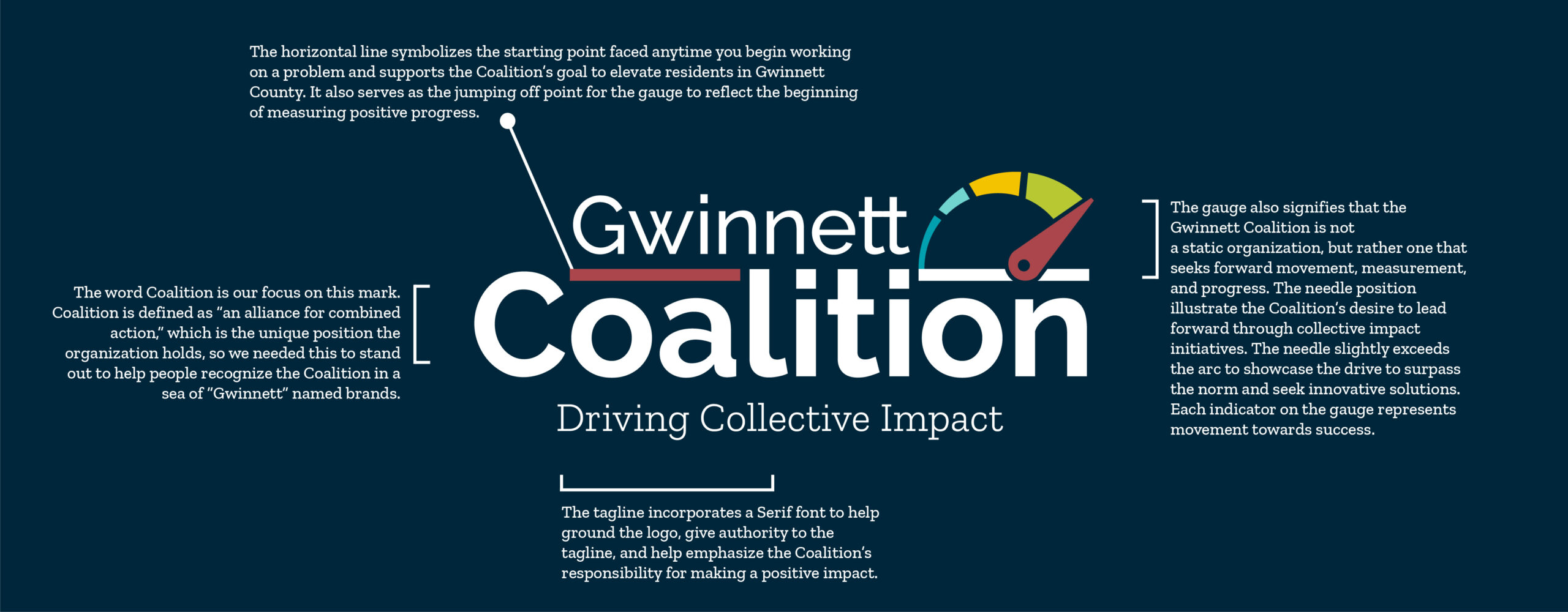
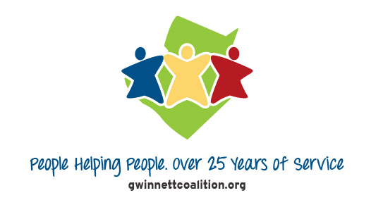
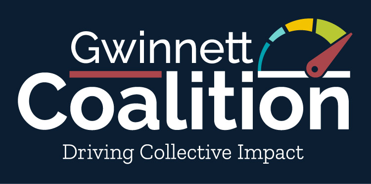
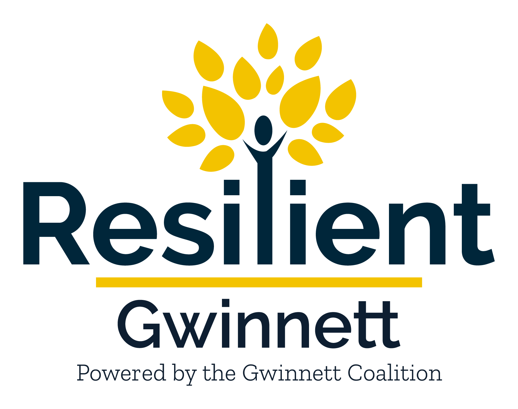
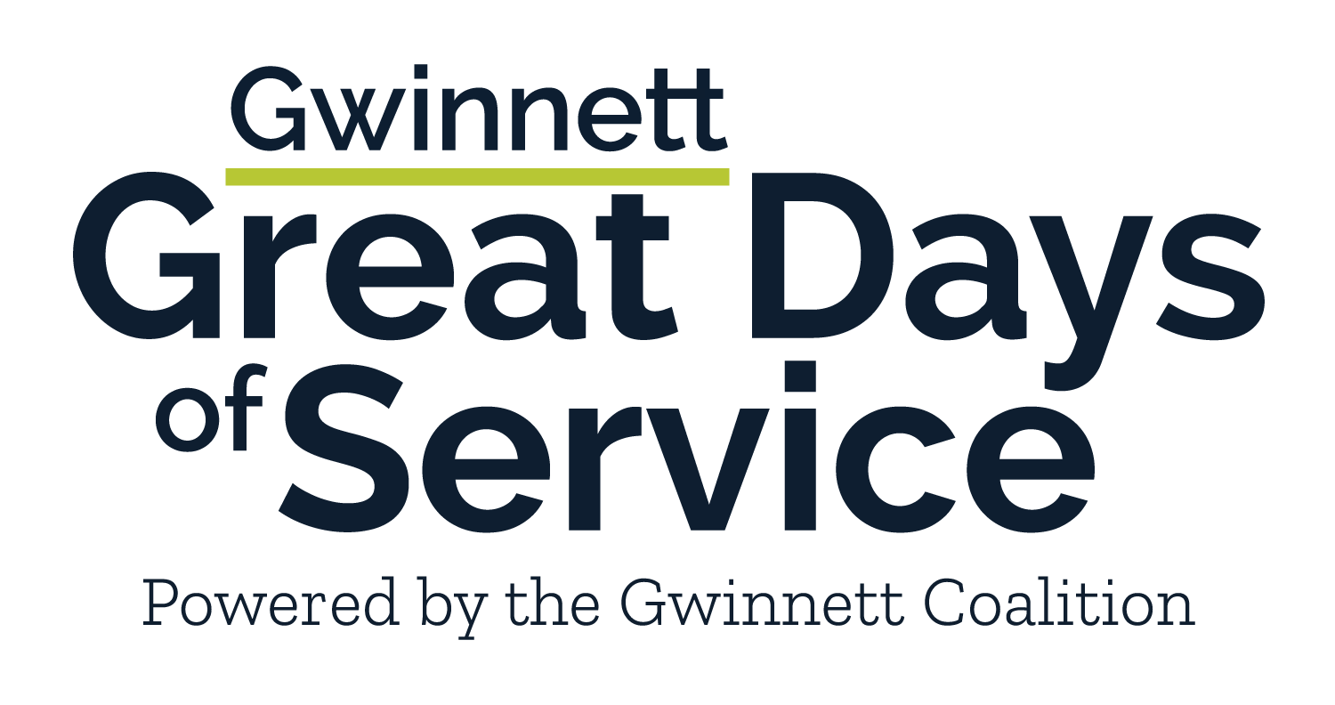
The Gwinnett Coalition for Health and Human Services opted to shorten its name to Gwinnett Coalition, allowing the organization to leverage its 30-year history and existing brand recognition while repositioning for its new collective impact approach and increased impact in the community. “Driving Collective Impact” was selected as the tagline. It describes how the Gwinnett Coalition is leading the way in aligning our community to develop solutions for Gwinnett’s most complex issues and ensure all voices in our diverse community are represented and heard.
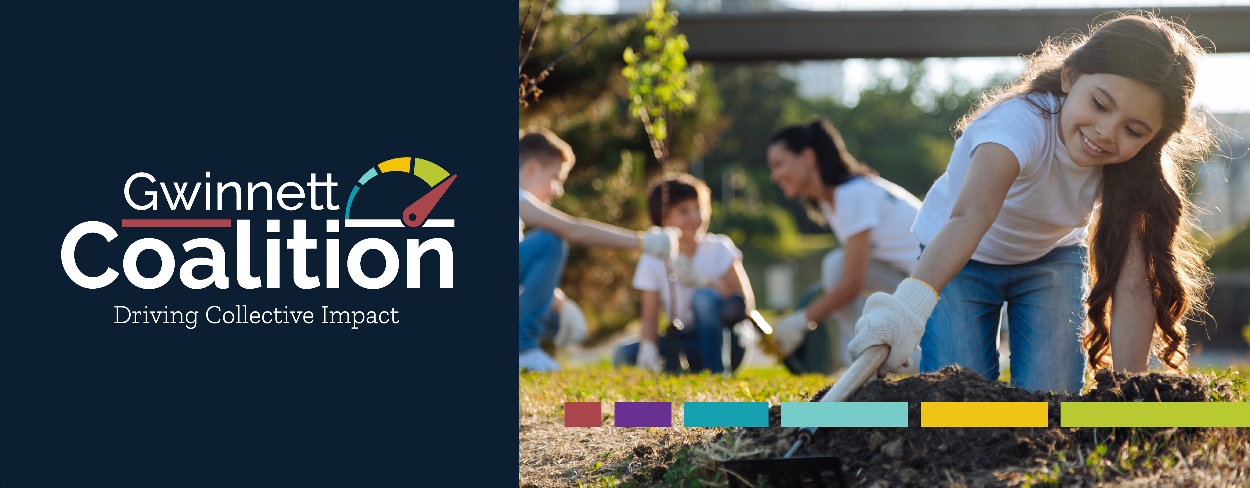
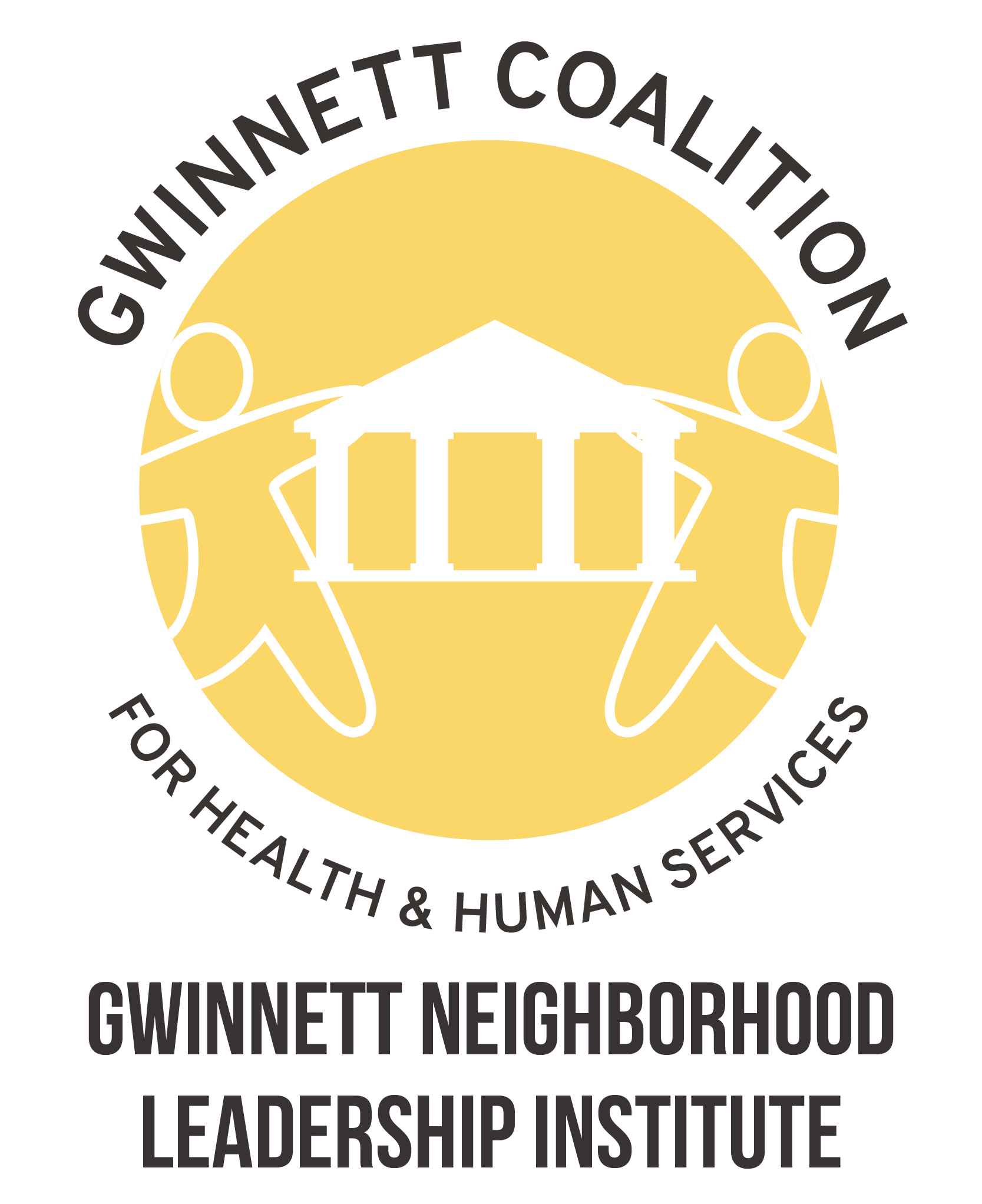
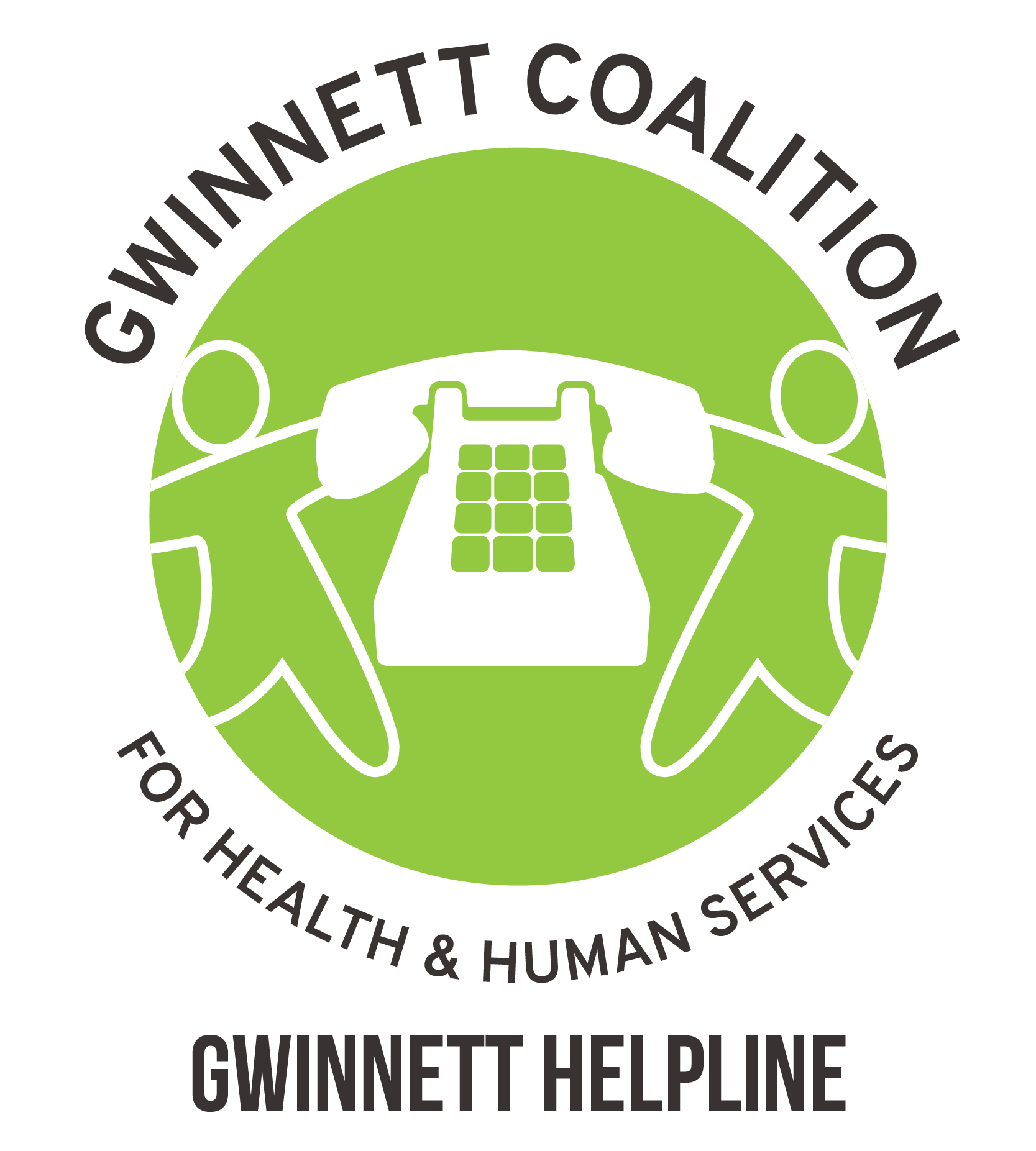
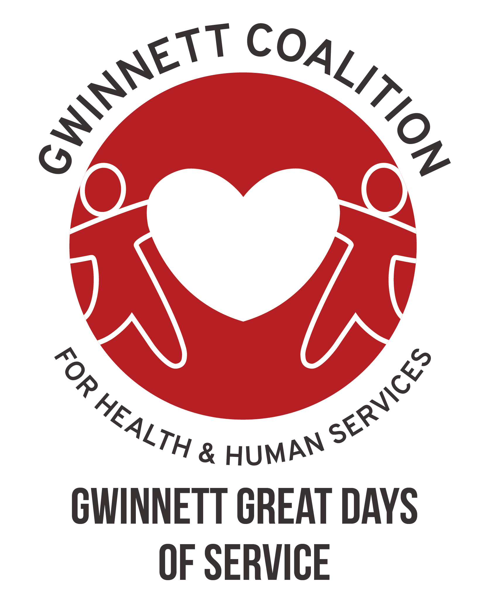
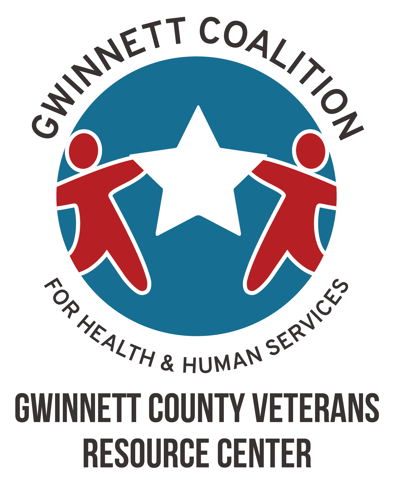
With the new name and tagline approved, we then focused our efforts on developing a logo to visualize the Coalition’s new direction and its commitment to measurable positive impact. A color palette was developed to reflect the energy of the brand descriptors as well as pay tribute to the vibrancy of Gwinnett’s diverse communities.
A deliberate choice was made to use a dark background for this logo to help signify a shift in the organization and its work. The stark contrast of the white text on navy symbolizes hope shining through, which is what the Gwinnett Coalition aspires to bring to the community.
The logo incorporates a clean, modern San Serif font reflective of a new direction as well as the following unique details:
The G forms an arrow with the arm for upward progression
The W shows overlap because we need the engagement of all sectors of the community to develop effective and sustainable solutions
The two Ts in Gwinnett showcase the connectivity or a passing forward of resources and sharing of knowledge
There is a softness to this font with the curves in the C, O, A, L, and T that makes it feel approachable
With the new brand in place, we documented the Gwinnett Coalition’s brand standards to ensure the brand is consistently represented in all forms of communications. We also set up the brand elements, including sized logos, business card templates, and other formatted assets in Canva, so that members of the Gwinnett Coalition team have the most updated files in one easy and accessible location. This will facilitate frequent use of the assets and help grow the new brand.
''
Rock Paper Scissors spent time learning about the Gwinnett Coalition, our new approach, and our goals for increased impact in the community. Then, they brought all their resources and capabilities to bear in envisioning our new brand. The co-creative process allowed for input from key stakeholders, and ultimately, the new portfolio of assets to communicate the Gwinnett Coalition’s story in a compelling and scalable way.
- Renee Byrd-Lewis
President & CEO, Gwinnett Coalition
''
This is my third logo project with your team in the last 12-months, and this one did not disappoint. The process and final pieces are fantastic! I am so impressed with your team’s work and how you really listen to the client and tell their stories through your creations!
- Tina Fleming
Director, Gwinnett County Community Services
Board Member, Gwinnett Coalition
About GWINNETT cOALITION
cLIENT siNCE 2005
The Gwinnett Coalition was established in 1991 as a public-private partnership with a goal of addressing the issues of the community’s rapid growth and the related implications on service and support mechanisms for the county’s residents. Over the years, the organization has teamed up with different organizations and community members to launch, advocate for, and support programs and initiatives designed to create the change needed to help residents of all ages thrive. In 2019, the organization adopted a new mission and vision centered on the idea of using strategic and collective impact models to help initiate long-term change. The organization now focuses on long-term efforts and change, rather than individual topics or issues, and aims to bring organizations together to create a shared agenda and work collaboratively to define problems and how various entities can participate in creating the solution.