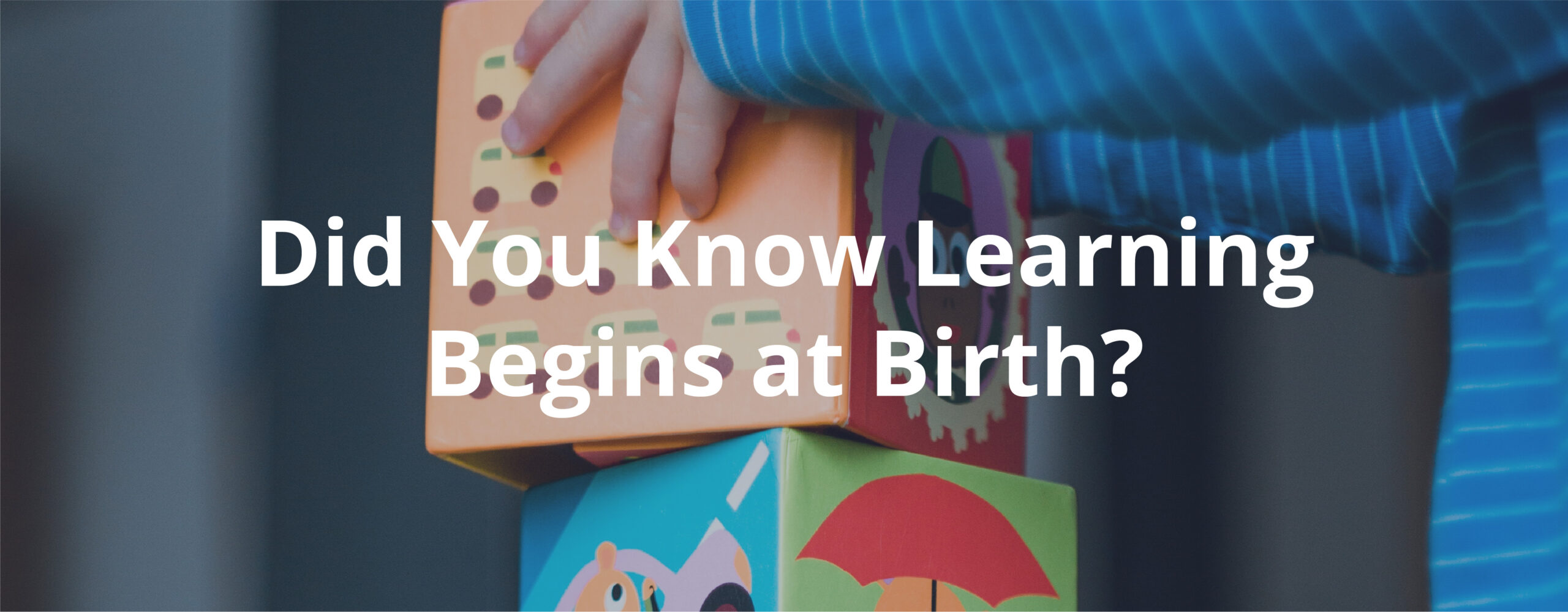
Did you know that a child’s brain is 90% developed by the age of 5? After recognizing a gap in their students’ preparedness when entering Kindergarten, a community group gathered key stakeholders and started an initiative focused on early learning called Gwinnett Building Babies’ Brains. The Early Learning Working Group focused on the overall need in the county, available resources, gaps in the community and worked on brainstorming ways to unite organizations that are already tackling these issues. With the initiative moving forward, key leaders within the group shifted their focus to building a brand that is parent focused and child friendly.
The Solution
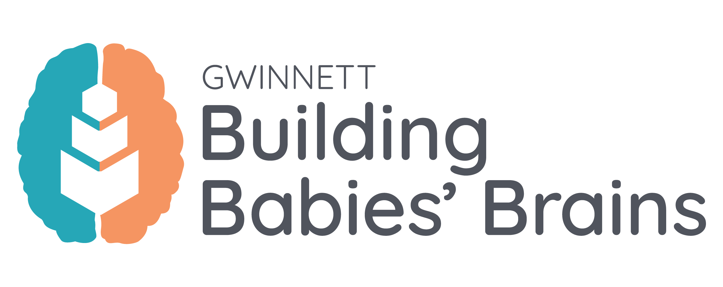
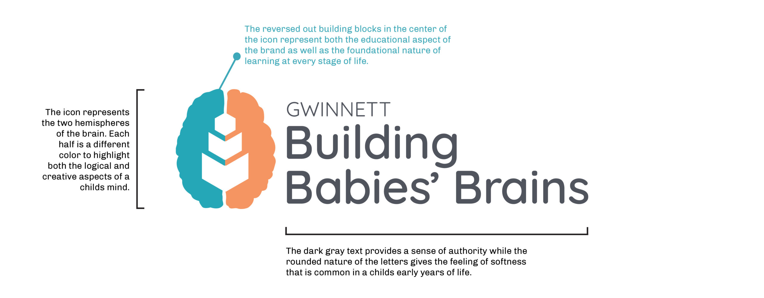
The Rock Paper Scissors team, having been involved through the earliest working groups, was able to jump right in and provide valuable insight as to how the brand could visually connect with parents and feel fun for young children. During early conversations the team zeroed in on two words: Building and Brains. Using these as inspiration, we created a simple logo that showcased the importance of early brain development.
The Building Babies’ Brains logo has 3 key elements: the brain icon, the negative space building blocks, and the text treatment. We were able to combine the complex brain shape with a child’s building blocks to emphasize the foundational learning that happens at every stage of life.
With the logo structure in place, we shifted to focus on color. The use of lighter pastel colors nods to those of child’s toys and books, while the darker gray text provides a stability that is attractive to adults and softens the overall look, keeping it from being too harsh.
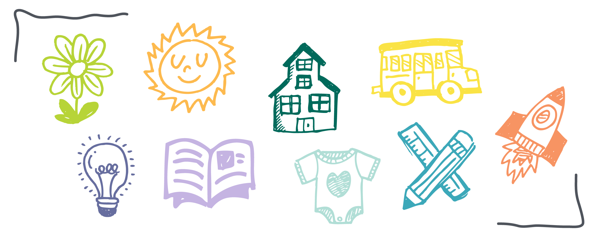
To round out the brand we pulled in some hand-drawn icons, scribble elements, and stylized lines to drive home the child friendly look. We also expanded the color palette to include colors that would be relatable to younger children as well as those old enough to be entering Kindergarten.
The Results
With a clean and colorful brand, Gwinnett Building Babies’ Brains is a recognized platform that the Early Learning Working Group uses to provide early learning resources to parents across the county. This effort has connected organizations and encouraged them to come together to strategically and effectively increase Kindergarten readiness and impact the success of future generations.
''
To me, this bold new logo and the development of our new website are also symbolic of the fact that Rainbow Village is on a continuous journey of its own to seek out the most effective ways to help families in need. The growth of this nonprofit over the last three decades has been nothing shy of miraculous, but we want to continue to stretch and grow in new directions to help as many families as we possibly can.”
- REV. Melanie Conner
chief Executive officer, Rainbow Village
About Gwinnett Building Babies' Brains
Client Since 2019
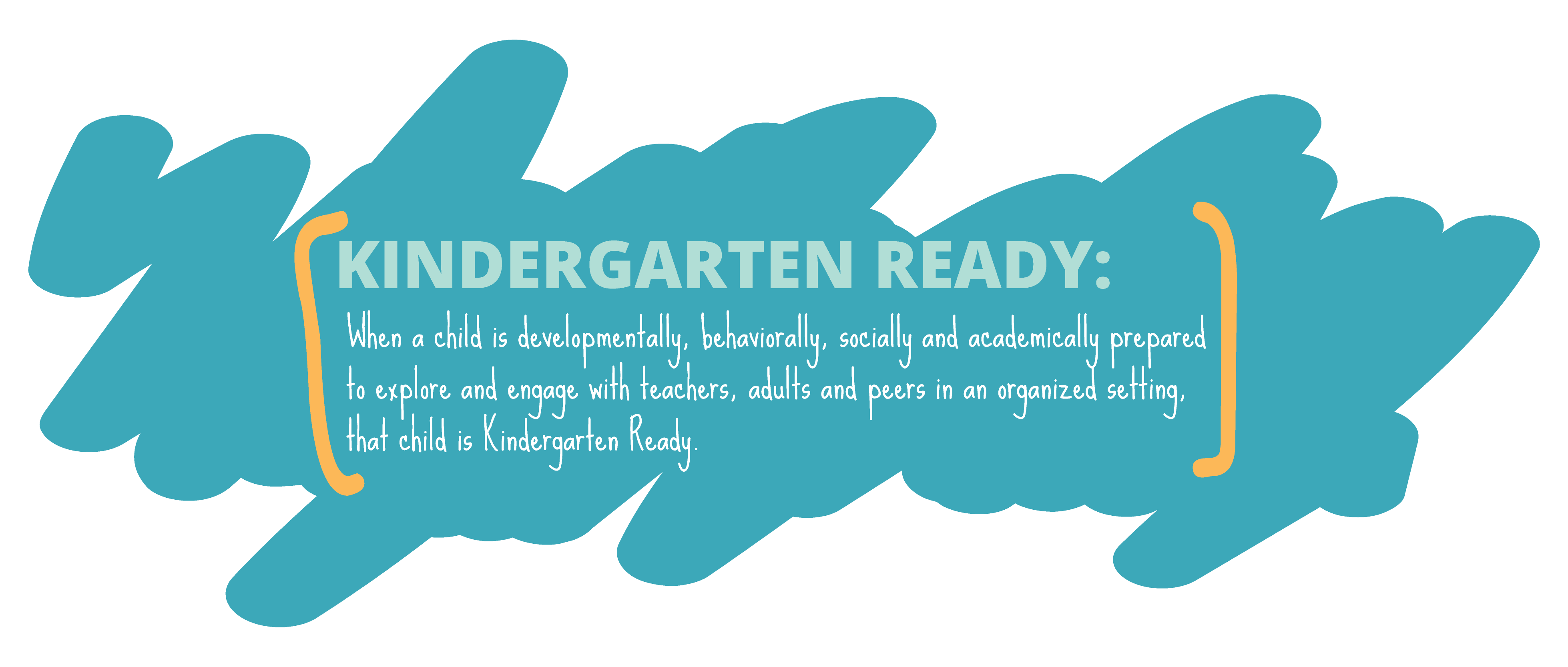
Gwinnett Building Babies’ Brains is an initiative focused on early learning and early childhood education developed by the Early Learning Working Group. The initiative provides parents with free or low cost resources and tools to increase Kindergarten readiness across Gwinnett County.


