Annandale Village Program Planning, Development and Launch
The Challenge
Annandale Village is a non profit organization dedicated solely to providing comprehensive and progressive on-campus life assistance to adults with a wide range of developmental disabilities and acquired brain injuries so they can maximize their abilities and maintain their independence in the least restrictive environment possible.
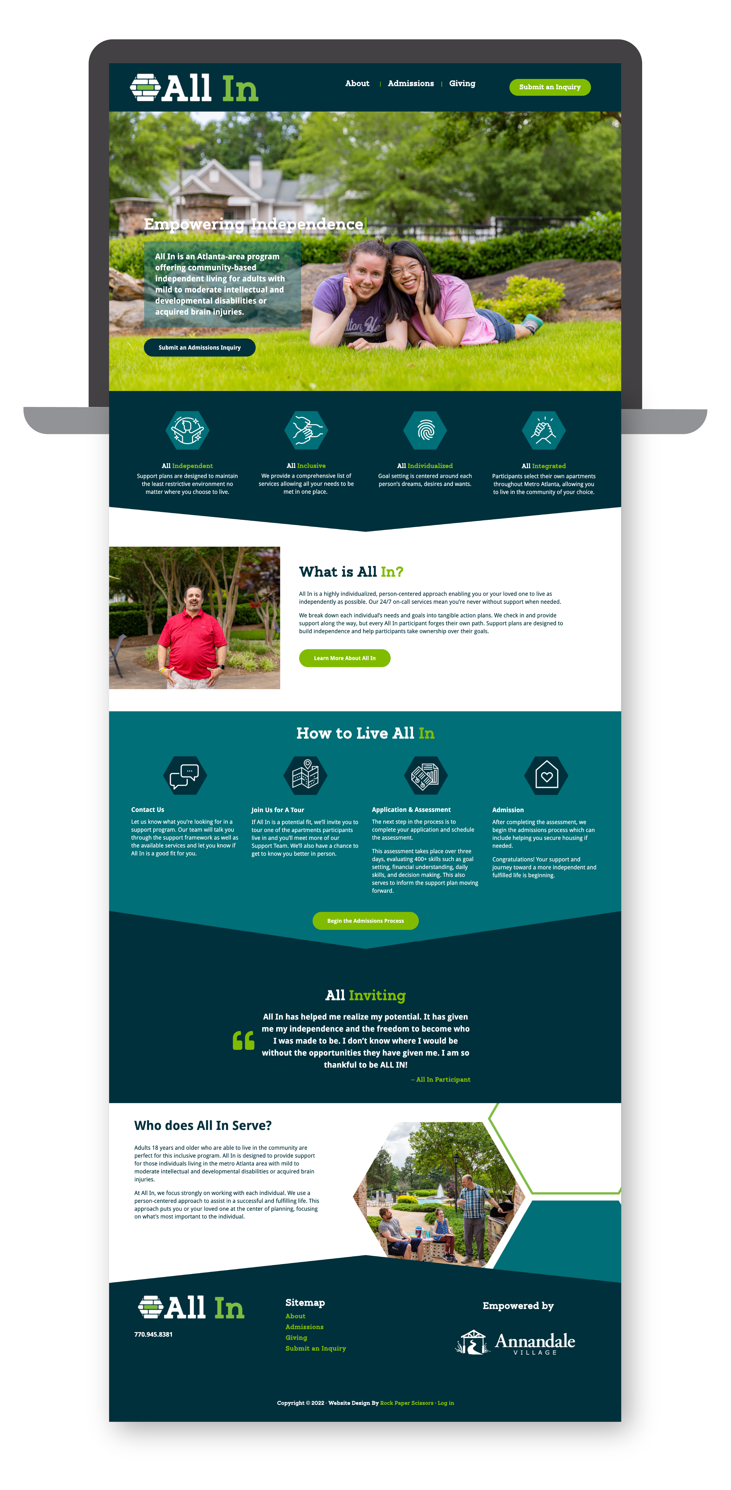
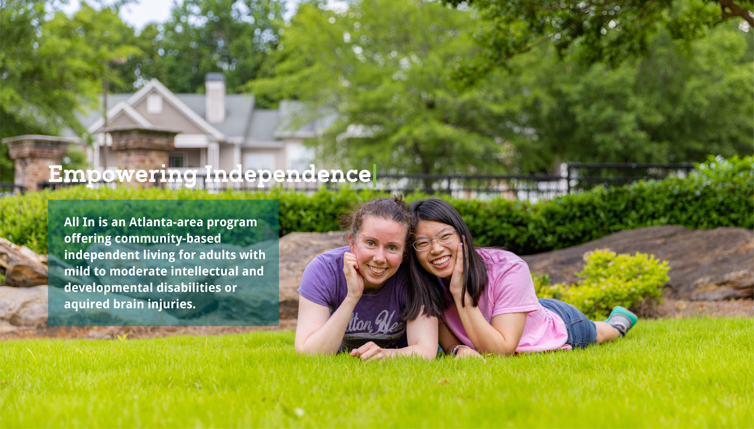
Annandale Village wanted to rebrand their current off-campus Independent Living Program. This program serves adults with mild to moderate developmental disabilities and acquired brain injuries who are seeking support services while maintaining autonomy and independence. As the parent brand, Annandale Village struggled with the decision on whether or not to maintain a clear connection with this new brand so as to not affiliate and confuse All In with their more comprehensive campus. Ultimately, they came to Rock Paper Scissors in hopes of creating and branding a program that would appeal to individuals who are seeking community-based independent living.
The Solution
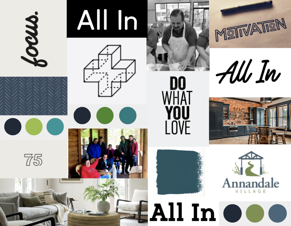
In order to create a brand based on their previous program, we recommended starting with several Brand Immersion Workshops to define the brand’s personality, tone standards and positioning in the marketplace. Once these were established, focus groups and interviews would be conducted to inform a name and logo that would reflect the new brand and appeal to a new audience for Annandale Village. From there, brand standards to inform the direction of the brand were created and messaging was crafted for a new website.
The Results
The research findings from focus groups and targeted interviews gave us the valuable insight needed to create a brand for the new All In Independent Living concept that resonates with a much more independent individual who has much less need of support than those who live on the Annandale Village campus.
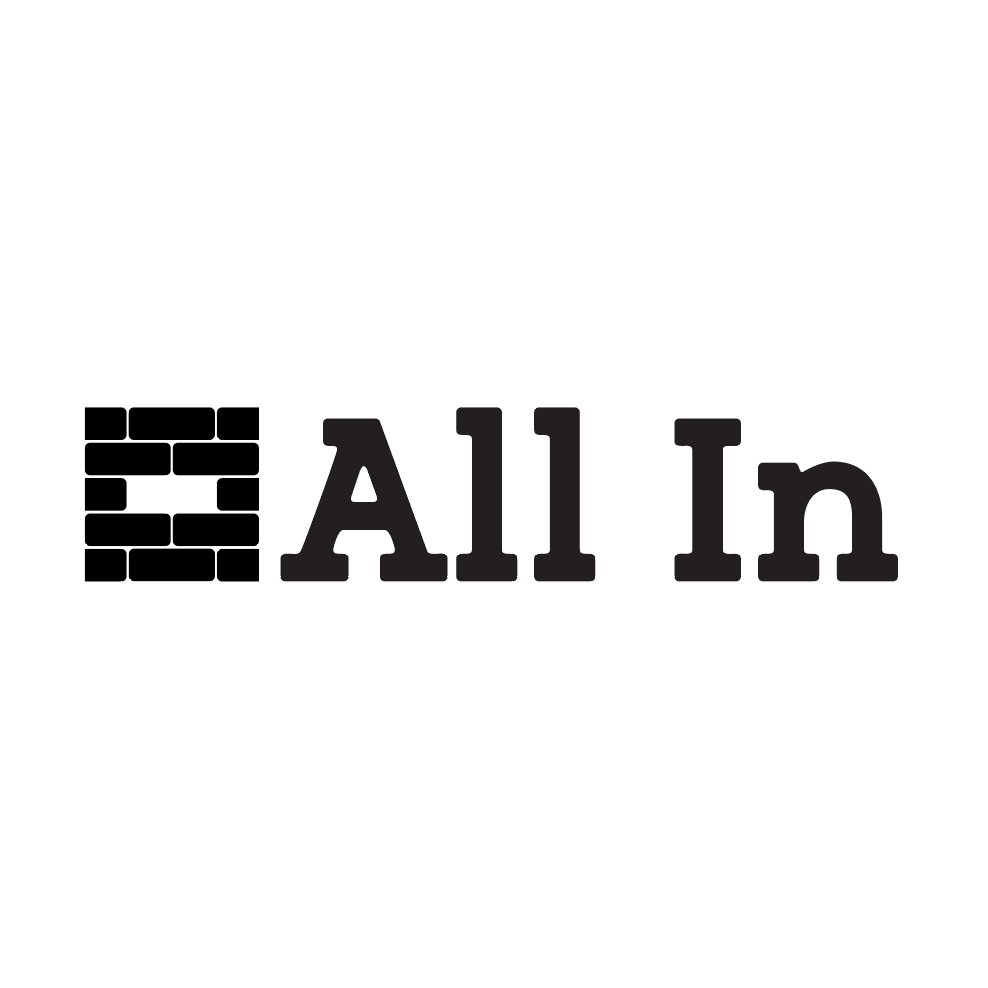
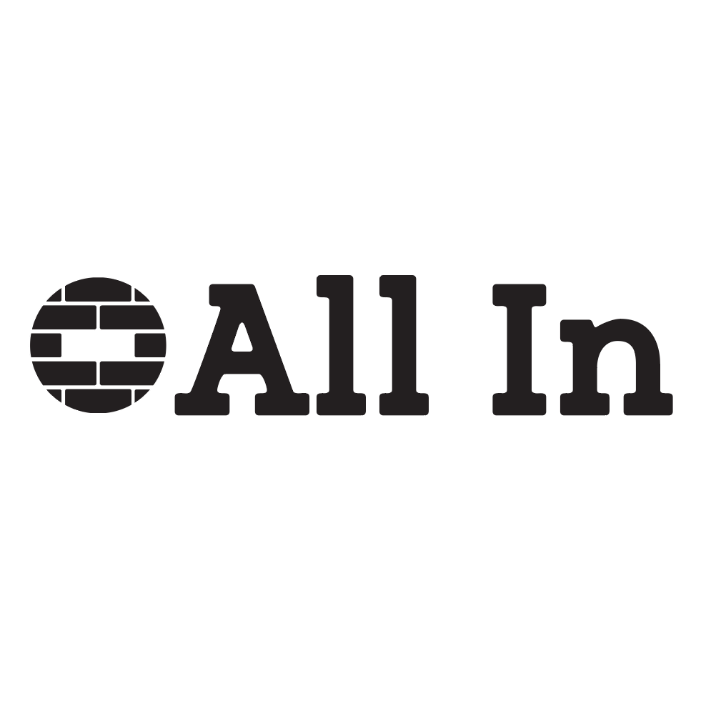
The name “All In” was chosen to focus on the lifestyle aspect of this new and unique program. Incorporating “In” words after the word “All” using words like (In)dependent, (In)clusive and (In)dividualized can be seen throughout their website to help highlight what this new program is all about.
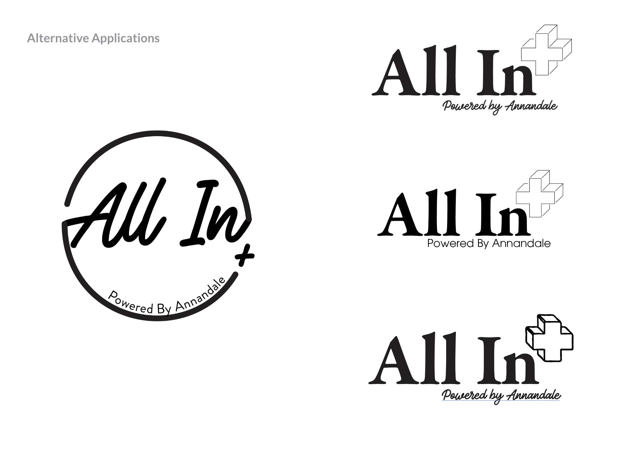
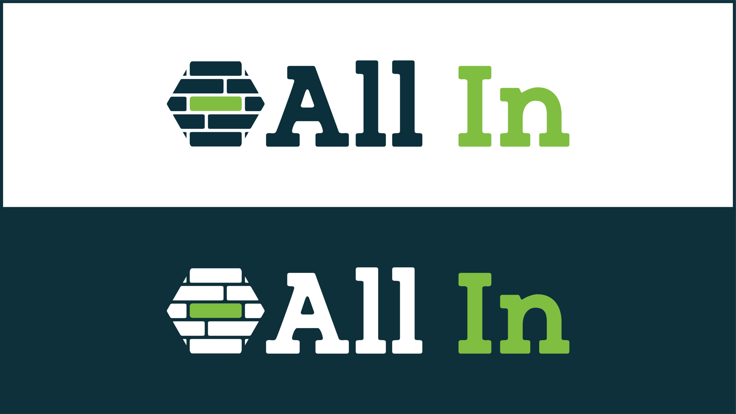
Although the logo is meant to mostly stand on its own, it still has subtle ties to the Annandale Village parent organization by utilizing their brand colors, blue and green, in a more vibrant and active manner. There is also a hidden element as the letters A and V can be found within the “support blocks” in the logo.
A mix of modern fonts and color give the logo a more hip feel to appeal to the young and independent audience that Annandale Village is aiming to attract. Because of the branding efforts and research we did upfront, the design and development of a cohesive and attractive website was much easier.
''
Our team at Annandale enjoyed working with RPS on this important project! The team was top-notch and helped us create a beautiful new brand, new logo and corresponding website. The process was completely seamless, and it is 100% because of the RPS team and their dedication to helping their clients.”
- Kayce Pearce
chief Development & Marketing officer, Rainbow Village
About Annandale Village
Client Since 2021
Annandale Village is the only non-profit residential community in the entire southeastern United States that serves adults with developmental disabilities and acquired brain injuries at all levels of care throughout an individual’s lifetime.
Created for adults with mild intellectual disabilities and those that have experienced an acquired brain injury, Annandale Village’s new brand, All-In, allows individuals the opportunity to live in the community while still receiving minimal to moderate oversight and support. The program allows an individual to select a residence of their choice, while receiving a comprehensive range of services that foster lifelong skills acquisition, community integration and independence.


